
Bijlmer, the south-east extension that Amsterdam started to realize in the seventies, is experiencing a major redevelopment. Close to the central business and shopping area Amsterdamse Poort and next to a train and metro station completely overhauled by Nicholas Grimshaw, architects Branimir Medic and Pero Puljic of the ArchitectenCie designed the Acanthus office building.
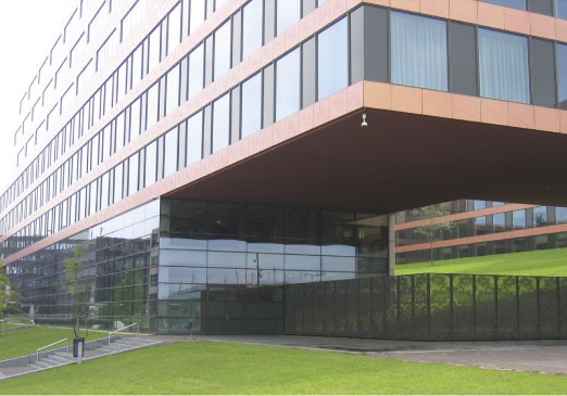
The building is situated next to the railroad tracks with a solid stretch that forms the backbone of the ensemble. From this central spine the edifice rises up in recognizable towers and extends out with cantilevered wings. Dividing up the building into interconnected parts in this way still keeps the inner structure intact, while at the same time the outside becomes architecturally more diverse.

Distinguishing a large complex into various and identifiable elements not only adds to the esthetic experience, it also can be instrumental in convincing potential tenants that their visibility is assured. Not only does this design feature help to attract clients, it also is an added boon for employees working in the building. People can look out from their offices and simultaneously get a view of the actual place they work in.

Parking
A service road is shoehorned in between the dike that carries the trains and the parking garage for office workers. Next to the tracks four levels of parking support offices that from there have a view to the west. At the east side, where the building meets ground level, the garage is only two stories high, one of them underground.
 |
Courtyard
Over this one-sided ziggurat of parking facilities a magic wand is thrown that completely obliterates this necessary but static function from sight. A slope of grass covers the steeped structure like a mountain meadow. Eight oak trees stand up as a bonsai forest in the middle of an irregular pattern of palms. |
 |
Interaction
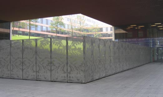
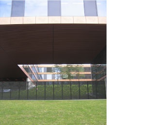
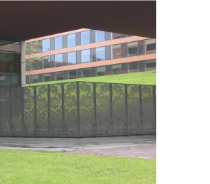
Acanthus, the plant with the flowery leaves that inspired the Corinthian order, is used throughout the building as an ornament derived from nature. With so much classic inspiration already in place, vegetation should be kept to a minimum to allow a full view of the architecture. Especially the two corners defined by the long cantilevers receive the respect and the spatial support they deserve. |
Client
ING Real Estate
The Hague
Credits
Branimir Medic
Architect
Pero Puljiz
Architect.